A metal business card isn’t “just nicer paper.” It’s a small object people handle like a tool or a keepsake, and the finish decides which one it feels like.
Matte warmth suggests steadiness. Brushed texture hints at craft. Mirror polish screams confidence (and sometimes ego). None of these are neutral choices. They’re signals, and the receiver reads them before they read your name.
One quick line that matters:
The finish is the first line of copy on the card.
The finish is the brand (yes, really)
Bold opinion: Mirror-polished metal is overused, and half the time it fights the design instead of elevating it.
Look, shine is seductive. It photographs well. It also throws glare across your typography, picks up fingerprints instantly, and can make a tasteful logo look like it’s trying too hard. I’ve seen gorgeous marks turn illegible under conference hall lighting because the finish wasn’t chosen with real environments in mind, which is why brands working with Metal Kards should think carefully about finish before anything else.
That said, when mirror polish is paired with deliberate negative space and crisp engraving, it can feel surgical in the best way. Like a precision instrument. You just have to design for the finish, not on top of it.
Texture that people trust: matte, satin, brushed
These finishes don’t beg for attention. They earn it.
Matte
Matte feels calm. It’s low-glare, low-drama, and it hides micro-scratches better than glossy surfaces. On a black or gunmetal substrate, matte can read almost “soft” even though it’s still a slab of metal (that contradiction is part of the appeal).
If your brand is legal, finance, security, or anything where “steady hands” is the vibe, matte is rarely a mistake.
Satin
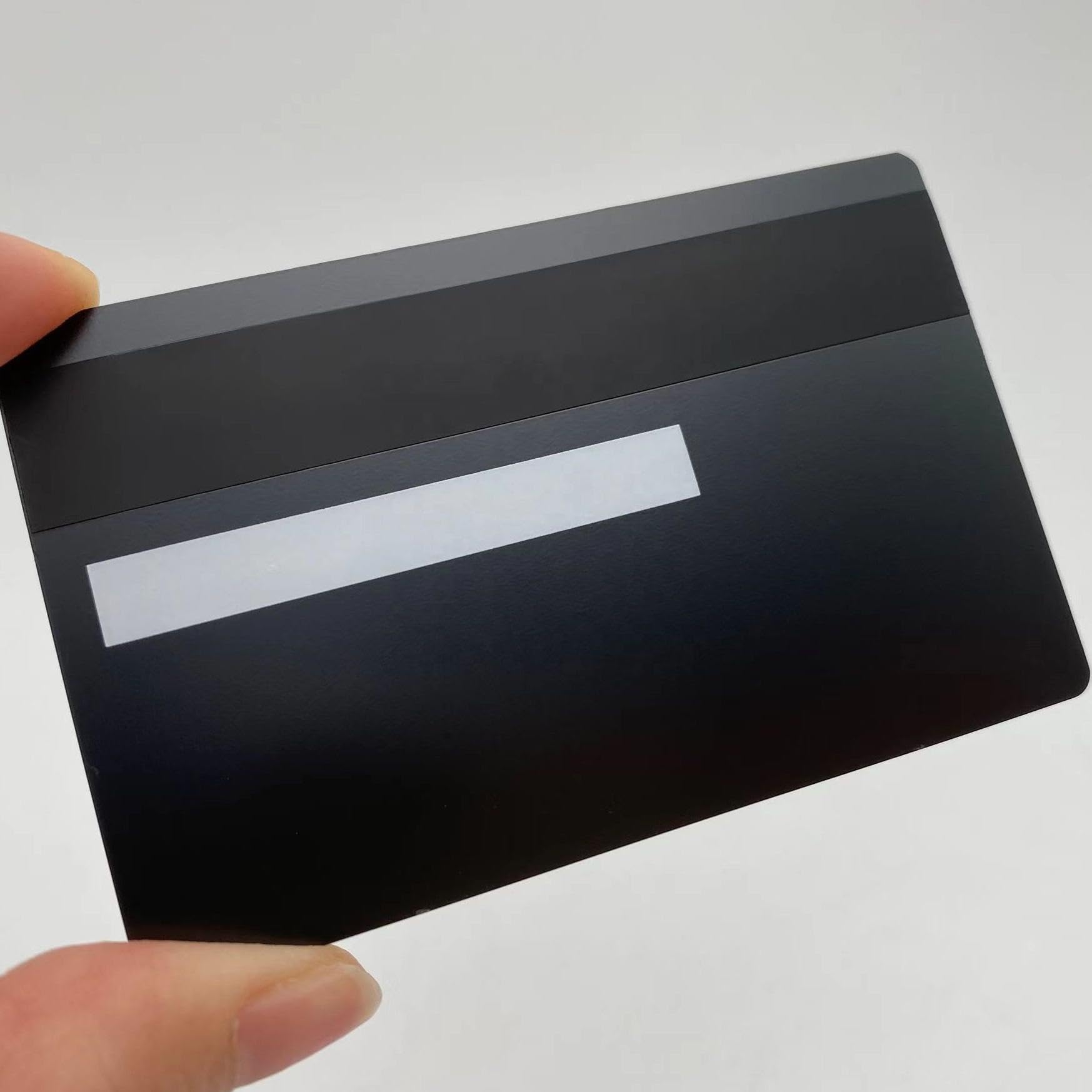
Satin sits in the middle. It has a controlled sheen that reads premium without turning your card into a tiny mirror. Legibility tends to be strong because highlights don’t wash across the whole face at once. In my experience, satin is the safest choice when you want upscale but not flashy.
Brushed
Brushed finishes introduce directionality. Those linear grain lines create movement, and they also do a nice job diffusing fingerprints.
One technical nuance: brushed grain interacts with small type. If you’re engraving thin strokes, align the typography and layout so the grain doesn’t visually “vibrate” against the letterforms. Sounds fussy. It matters.
Shiny, mirror, chrome: impact finishes (use with restraint)
You hand someone a chrome or mirror card and it performs in the light. It catches overhead fixtures. It reflects the room. It almost becomes kinetic.
That’s the upside.
The downside is hierarchy gets harder. Everything competes because everything is bright.
A few practical patterns I’ve watched work reliably:
– Mirror face + deep laser engraving for contrast that doesn’t rely on ink
– Polished edges + satin front/back to keep the “wow” without killing readability
– Chrome + minimalist layout (big logo, fewer lines, no tiny disclaimers)
And yes, chrome scratches. It’s metal; it lives in pockets and wallets. Scratches on glossy finishes show sooner and more dramatically than on textured ones.
Colored and anodized metals: branding without clutter
Anodized color is one of the cleanest ways to signal brand identity on metal, because the color becomes the field, not a printed layer trying to survive abrasion.
You can do loud colors. You can do restrained ones. Either way, the trick is contrast.
Black anodized with bright metal engraving is a classic because it reads instantly at arm’s length. Deep blue, green, or red anodizing can look modern and intentional when paired with simple typography and one accent metal (gold or silver fills, for example). Too many accents and the card starts feeling like a gadget.
Small technical aside: anodizing is common on aluminum; stainless steel uses different coloration/coating processes. So your material choice locks in some finish options early.
Engraving, embossing, and how the finish changes them
This is where the specialist hat goes on.
– Laser engraving on reflective finishes creates crisp micro-detail, but you need depth or darkening to maintain contrast under glare. Fine lines look amazing until a light source hits them head-on.
– Embossing/debossing reads best on satin and brushed surfaces because shadows form softly along the relief. On mirror finishes, relief can disappear unless it’s exaggerated.
– Inlays/fills (paint or metal) can rescue legibility on shiny surfaces, but they add manufacturing steps and sometimes introduce wear points if the card is abused.
If you want the card to feel expensive in the hand, relief details matter more than people expect. A shallow deboss around a logo can do more for perceived quality than switching from satin to mirror.
A real-world data point about fingerprints (because people ask)
Fingerprints are one of the main complaints with polished metal cards, and it’s not just anecdotal. A study on stainless steel surface finishes found that rougher textures reduce visible fingerprint residue compared to smoother, high-polish surfaces (the residue spreads differently and highlights are less continuous). Source: J. Phys. D: Applied Physics, “Fingerprint contact and the influence of surface roughness on fingerprint visibility” (peer-reviewed; surface roughness correlates with perceived fingerprinting).
Translation: brushed and matte finishes hide grime better. Polished finishes show the truth.
Durability and care (the part nobody thinks about until week two)
Now, this won’t apply to everyone, but if you’re the type who tosses cards into a pocket with keys, don’t pretend you’re a “mirror finish” person.
Textured finishes disguise wear. High gloss spotlights it.
A simple care rhythm works:
– Wipe with a soft microfiber cloth
– Use mild soap + water if oils build up
– Dry gently; don’t grind grit into the surface
– Skip harsh solvents and abrasives (they can haze coatings and flatten micro-embossing)
Some metals also develop patina depending on alloy and coating. That can look gorgeous, honestly, but it should be a choice, not a surprise.
Matching finishes to audience and use case (quick, blunt guidance)
If you’re stuck, go scenario-first:
Corporate / legal / finance: matte or satin, high legibility, restrained contrast.
Creative industries: brushed + one bold detail (edge polish, color anodize, or a single reflective zone).
Executive meetings: brushed or satin with precise engraving and clean margins.
Trade shows: durable texture, maybe one accent, because the card will be handled a lot.
High-end luxury / nightlife / “presence” brands: mirror or chrome, but keep the layout minimal so the finish doesn’t eat the message.
And please request a physical proof if the vendor offers it. Screens lie about metal. Your hand won’t.
One last thought (because it’s true)
A metal card finish is basically your handshake in material form.
Make it firm. Make it appropriate. And don’t make it slippery on purpose unless you really mean it.